Davie, Florida
Fruits n Cahoots

Home is where the fruit is.
01 / The starting point
From the market
to a growing brand.
Fruits n Cahoots was expanding its digital and market presence without a consistent visual identity. I took inspiration from its Florida market, where seasonal fruit drawings and groovy handwritten signs already gave the space a distinct personality.
I developed that visual language into a cohesive brand system, combining expressive lettering, a fruit-inspired palette, and playful illustrations. The business has begun rolling out the identity, including the wordmark on its existing website.
02 / The identity
A familiar spirit.
A recognizable system.
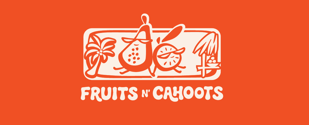
The market’s groovy, handwritten signs informed the lettering. A flexible family of wordmarks, a compact monogram, circular marks, and an illustrated lockup carry that personality across different scales and spaces.
Primary wordmark
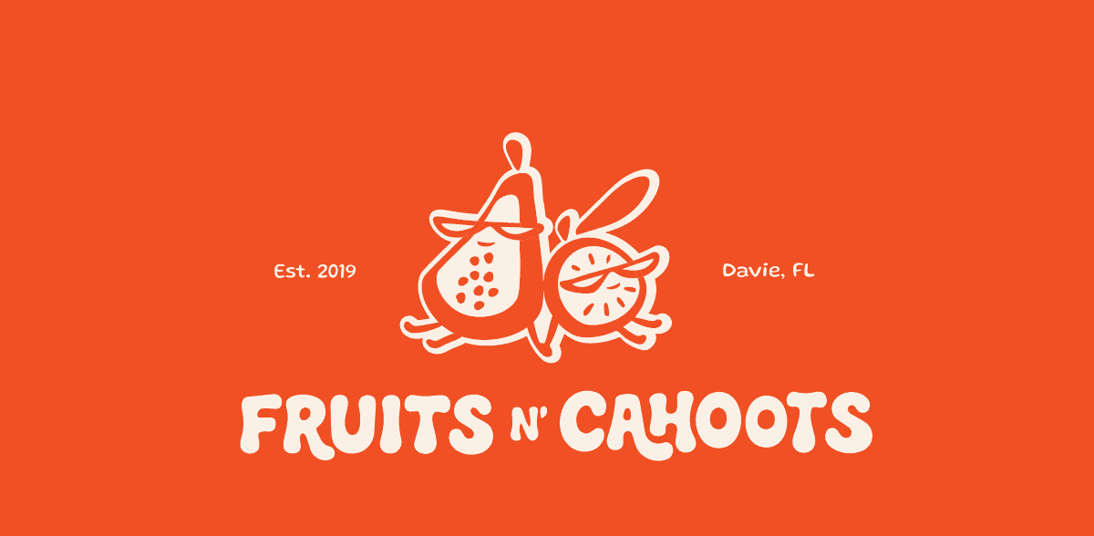
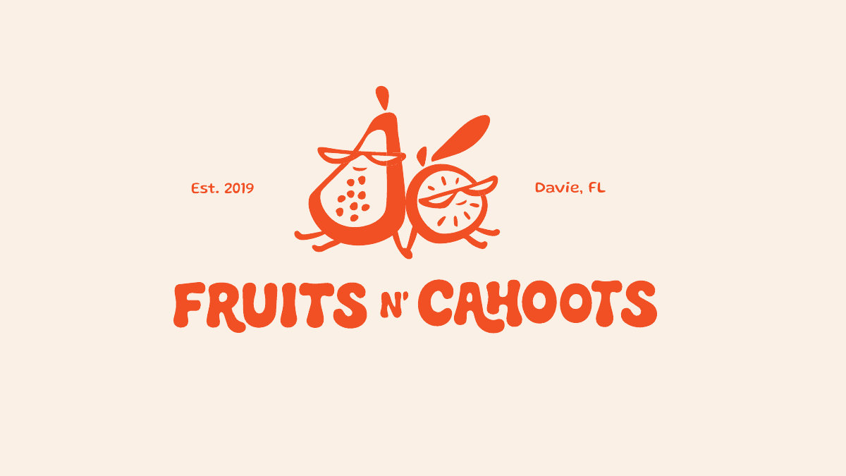
The full name leads. A horizontal signature for open spaces, with a stacked version for compact formats.
Supporting signatures
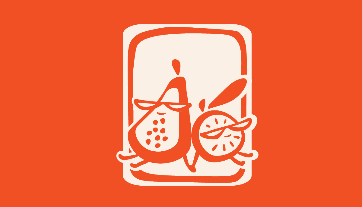
A family of monograms, fruit-duo emblems, alternate lockups, and graphic treatments. Each brings a different expression of the same market spirit.



03 / Color & type
Sun-warmed.
Fruit-inspired.
Mamey orange gives the identity its energy. Cream and Cacao ground the system, while Leaf and Mango bring the colors of the market into the palette.
Expressive where it counts. Clear where it matters.
Gluten / Expressive accents
Fresh fruit alert!
Fraunces / Headlines
This week’s ripest picks.
Instrument Sans / Everyday information
Come curious. Ask what’s ripe. Discover a new flavor, and pass it around.
04 / Identity applications · Mockups
From the fruit stand
to the everyday.
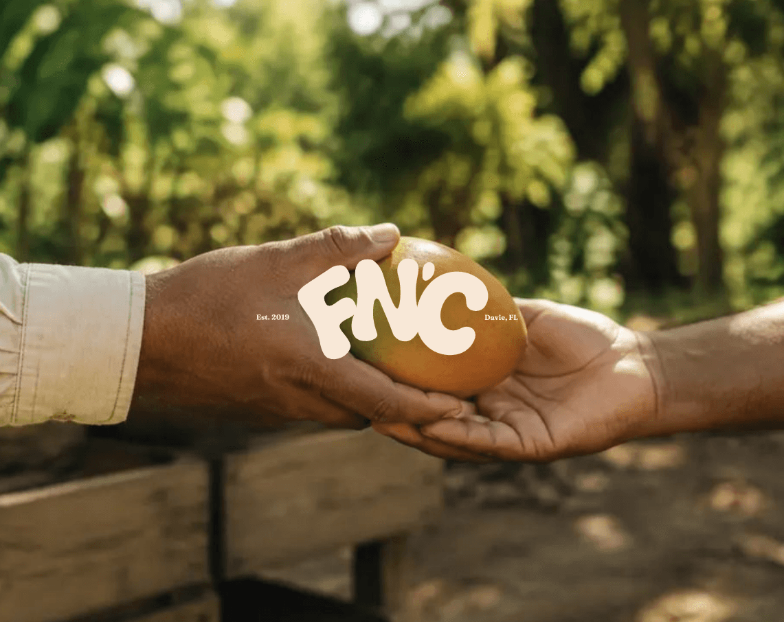
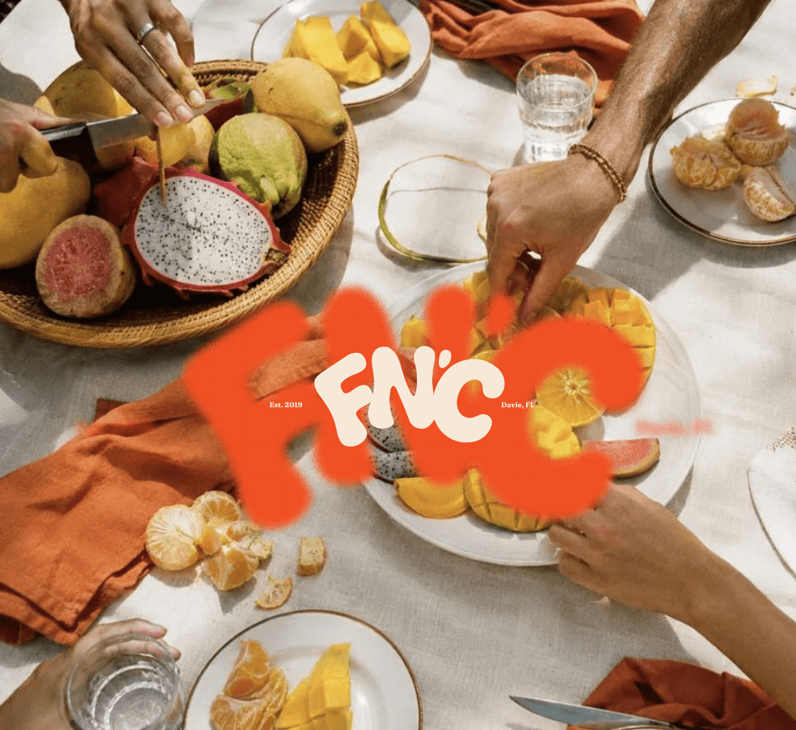
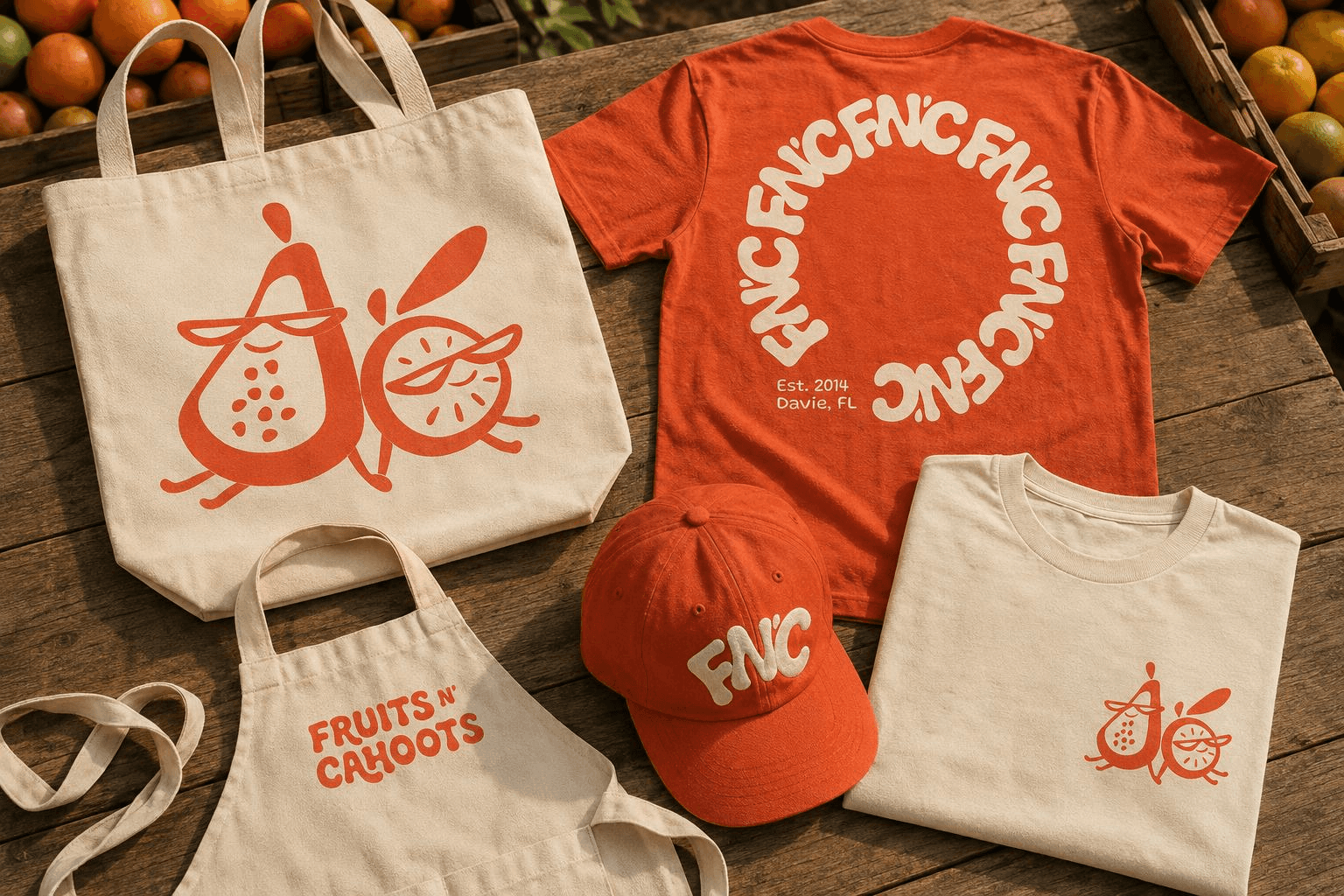
The identity comes together across fruit crates, packaging, drinks, merchandise, and the storefront. These concept mockups explore how the logo family, colors, and supporting graphics work as one recognizable system.


05 / Website design · In progress
Bringing the
market online.
I extended the identity into a website designed around discovery: introducing seasonal fruit, sharing the story behind the stand, and inviting people to visit. Warm imagery, expressive typography, and practical information bring the market’s personality into a digital experience. The website design is in progress.



